

Idea
I wanted to combine various type inspirations and different styles of lettering into one logotype to express creativity, inspiration and ways to incorporate hand lettering and vector design.
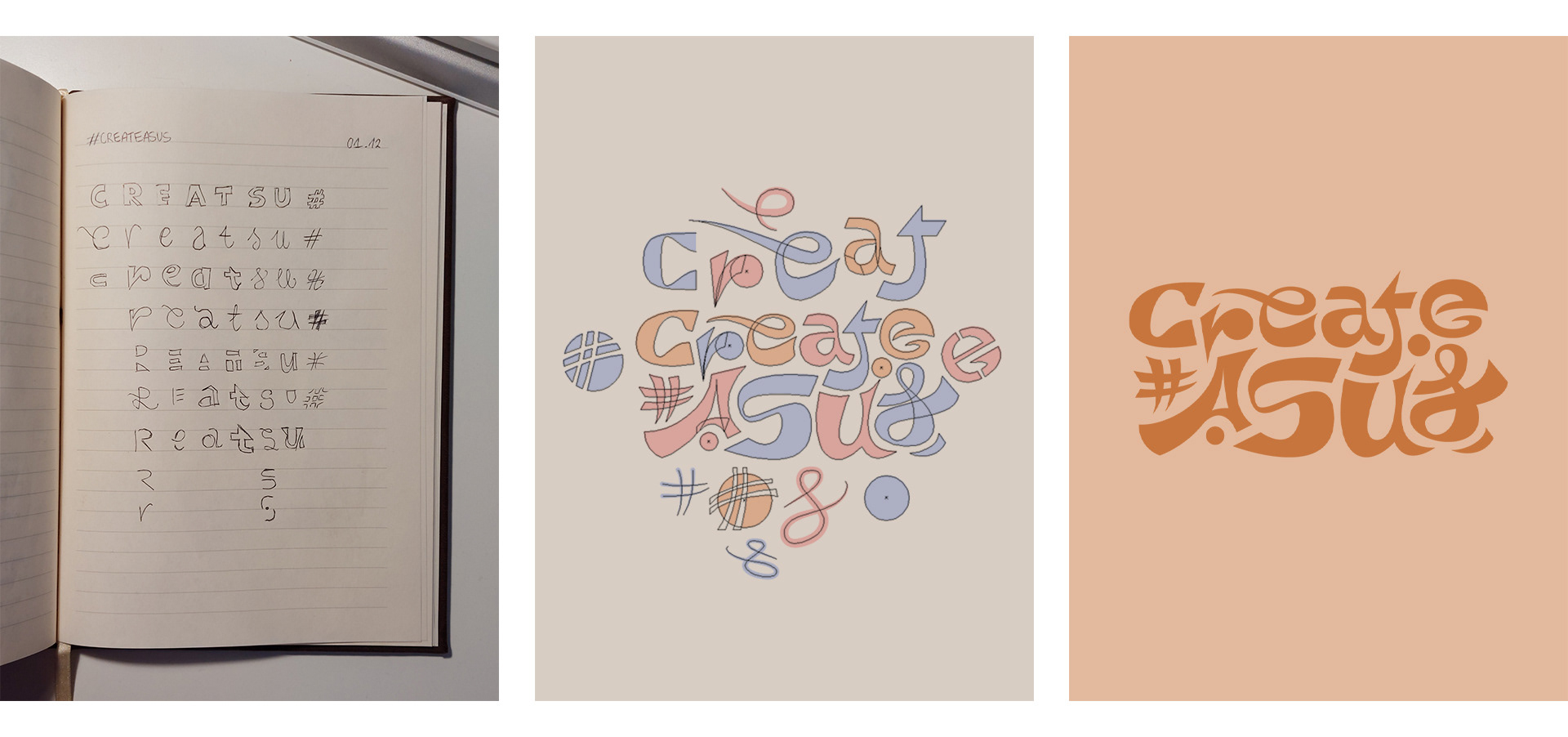
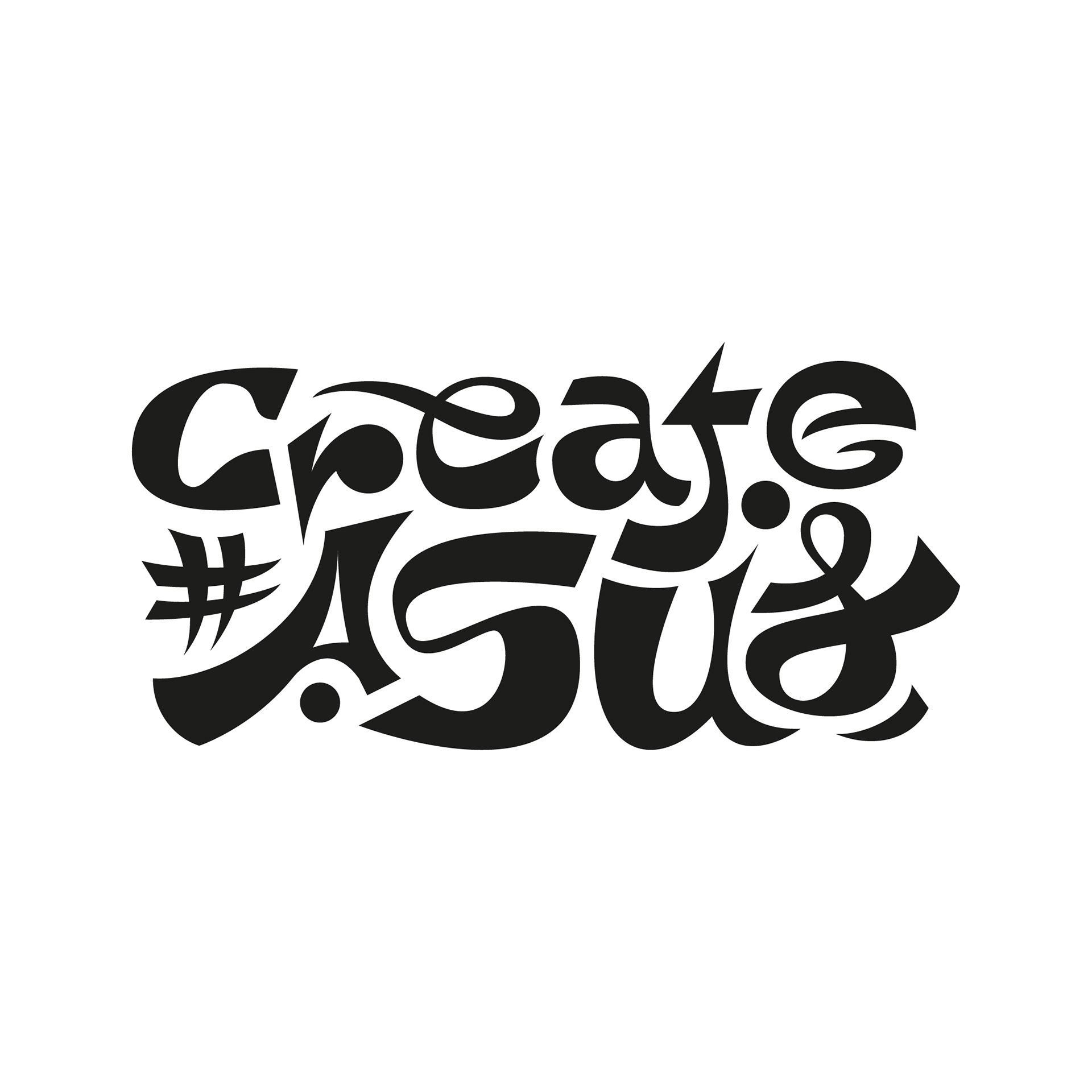
Design process
I started out with a technique most familiar to me - handwriting. After sketching out different types of designs for each letter of the name. Then I picked the most suitable and created the logotype.
The most important step was making sure the negative space was consistent across the whole design. This created the feeling that letters are an extension of one another and are interpreted as a whole.
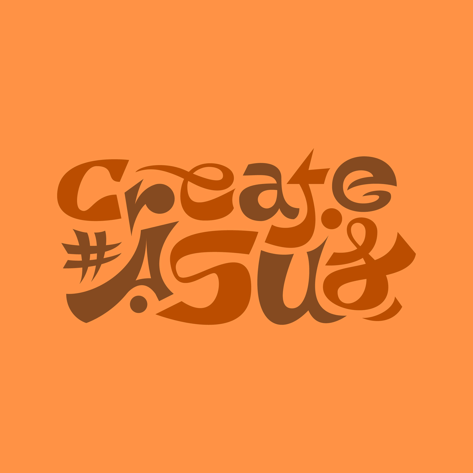

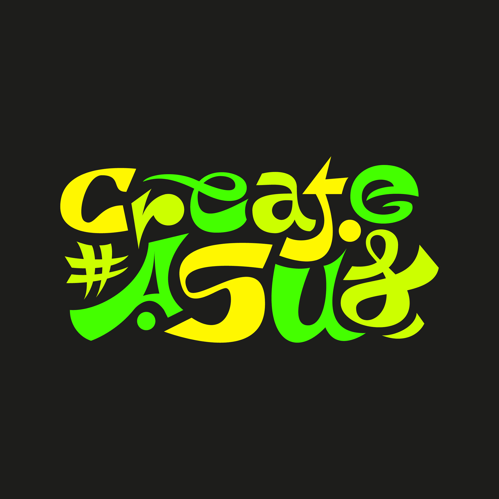

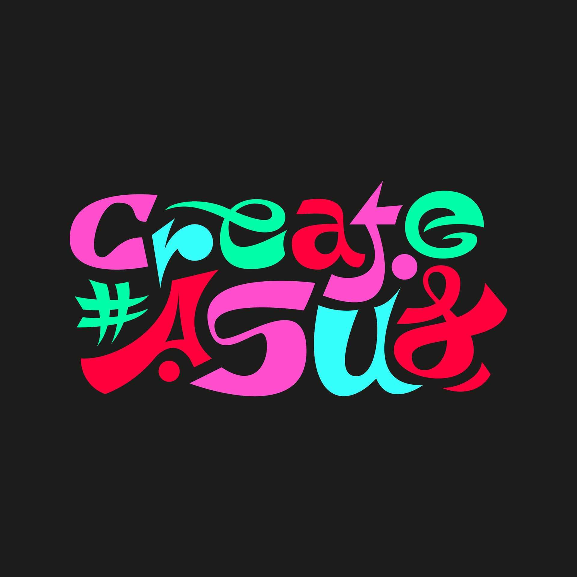
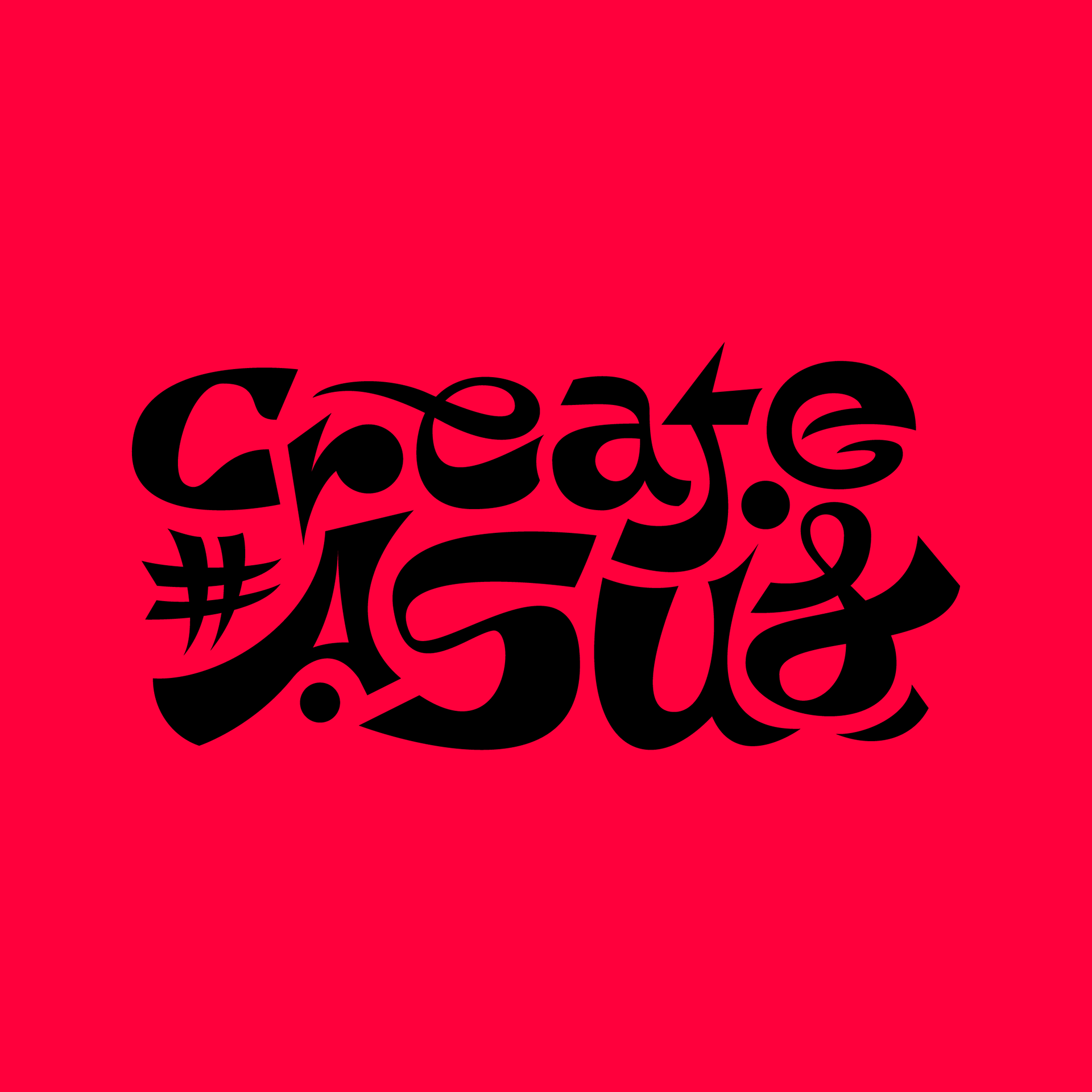
Colors
After creating the final type design and making sure it works in monochrome, I started ideating about the colors I wanted to incorporate. With various possibilities in mind, I chose "infrared" color which to me best captures the creativity aspect of the type and is an instant eye-catchj
This project was created as an entry for #CreateASUS competition, 15th edition.